Standing out in a sea of sameness

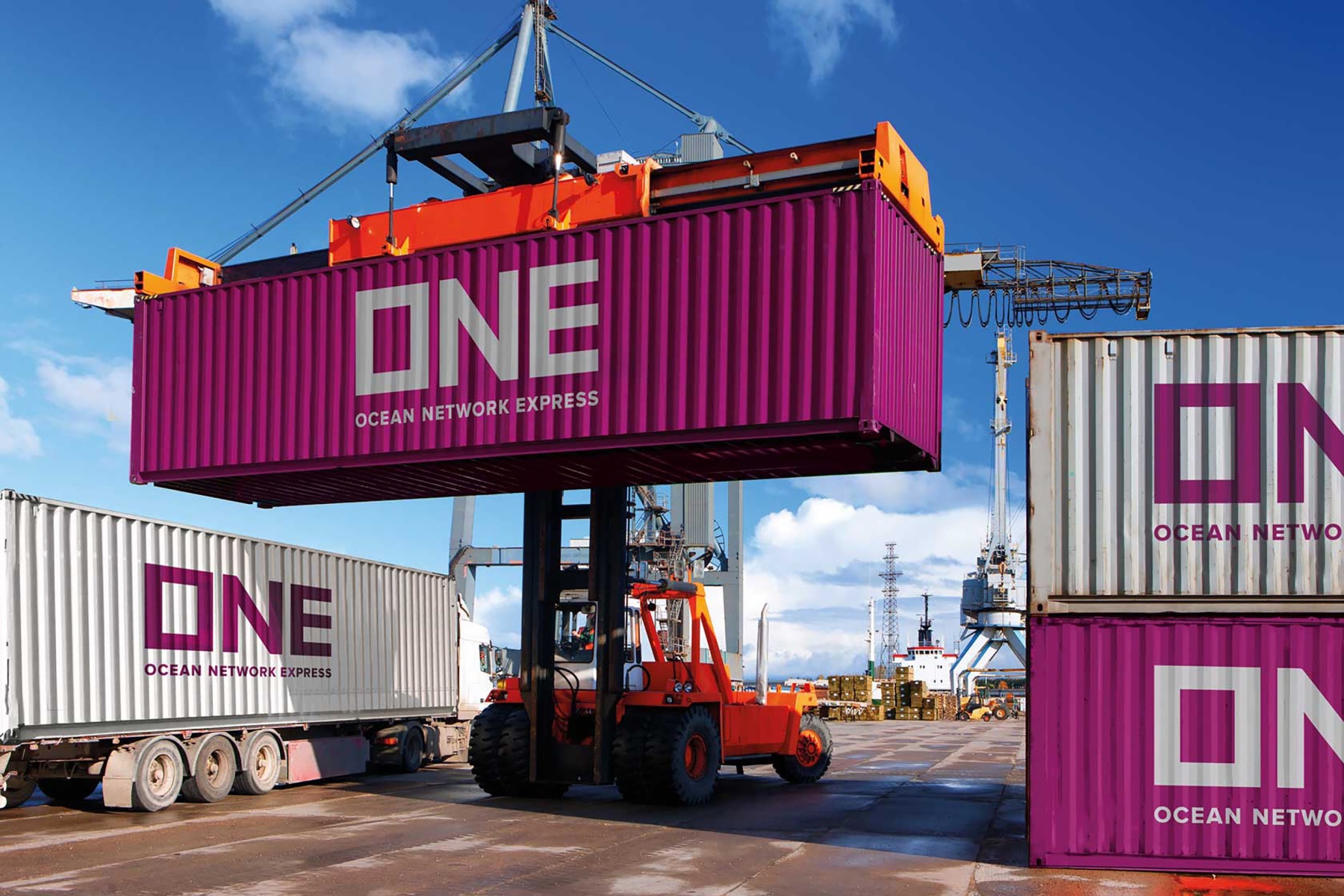
WMH&I brought together Japan's largest container companies (NYK, MOL and K Line). Through finding a common purpose that targets B2B customers across the world, WMH&I created an identity that is deployed across 2 million containers and 240 enormous ships.
ONE's most distinctive visual asset, its magenta colour, takes inspiration from Japan's iconic cherry blossom. This eye-catching colour disrupts the shipping-container market. In addition, WMH&I created a visual identity based on the shape of the humble container itself. Enabling ONE to 'frame' the world and its resources, as well as highlight the company's ability to transport assets around the globe.