
The Art of the Redbreast Robin
A Study in Character: Collaborating with Gary Redford on the Redbreast Robin
As part of Redbreast’s visual reawakening, the robin, long a familiar presence in the brand world, was elevated from supporting character to iconic emblem. Central to this transformation was the illustration itself: a balance of elegance, character and emotional resonance that could carry the brand confidently into its next chapter.
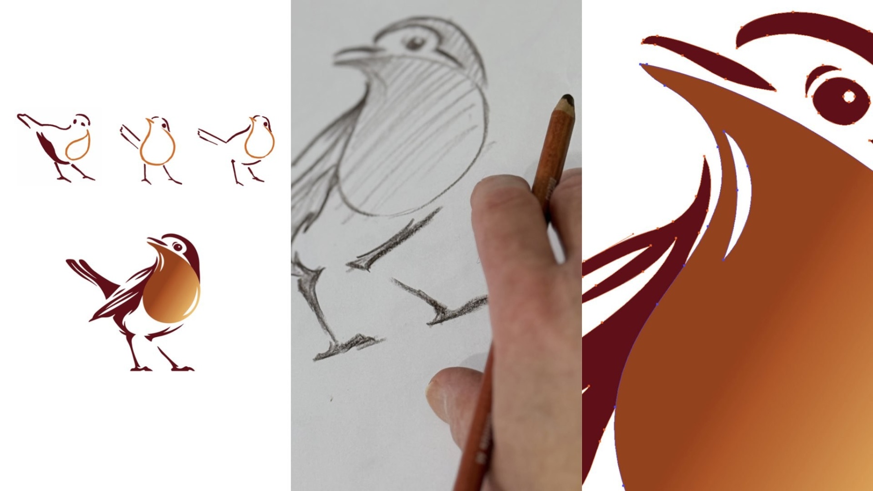
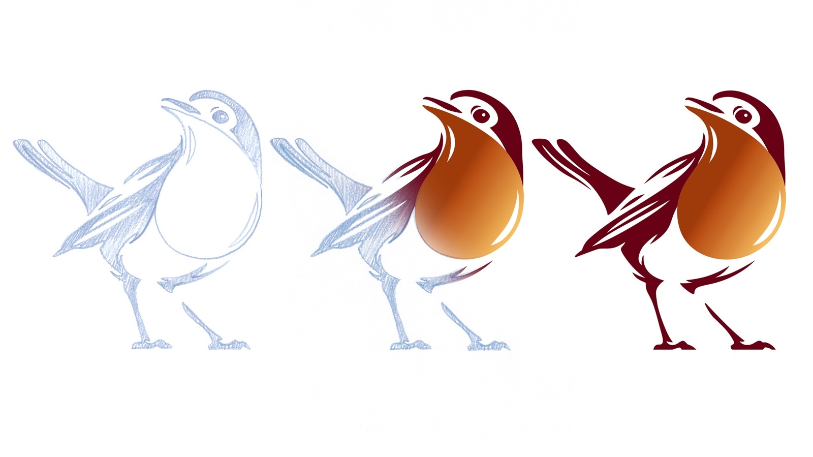
To bring this vision to life, we collaborated with renowned illustrator Gary Redford, whose graphic precision and instinct for storytelling helped reimagine the robin in a way that feels both timeless and alive. Working closely together, we explored posture, movement and detail. Culminating in a design where the robin’s red breast becomes a single drop of whiskey, uniting heritage, craft and liquid in one distinctive mark.
We sat down with Gary to talk about his journey into illustration, his creative process, and what it takes to reimagine an iconic symbol without losing its soul.
1. How did you first get into illustration, and what drew you to this particular craft?
I was always drawing from a young age. I loved the Tintin comic books and the animated Disney films with their graceful movement. I grew up amongst creative people and wanted to do something where I could draw and be creative. I started in a London design agency pre computers when everything was done by hand, doing ad layouts, illustrations and designing logos. Then onto bigger design and advertising agencies, and then I decided to focus on what I loved most which was illustration and graphic design, which I’ve enjoyed for the past 20 or so years.
2. When you first saw the Redbreast brief, what excited you most about it?
It was a fantastic brief to be asked to draw the Robin for this well loved whiskey brand. Robins are such an iconic and loveable creature, so I couldn't go wrong!
3. The Redbreast Robin redesign feels both elegant and alive. How did you approach capturing that balance of precision and emotion?
A lot is in the pose, because if you can keep that natural familiarity then the stylistic abstraction doesn't take over; there is a balance and a poetry in both coming together. The desired outcome is for the viewer to feel an emotional connection with the brand, so I’m very happy if that comes across.
4. Can you walk us through your creative process, from first sketch to final illustration? Do you work digitally, traditionally, or a mix of both?
The initial sketches in pencil were observations of how our Robin moved and stood. I then applied more design styling in Photoshop with a digital pen. Then I create the image in Illustrator, working with the design team on detail tweaks. Once the agreed design was signed off, a final master artwork file was created.
5. What was the biggest challenge in reimagining such an iconic symbol without losing its familiarity?
One of the really interesting challenges from the design team was to incorporate onto the robin a droplet of whiskey, which is such a genius idea. The curl at the top of the droplet gave the idea to explore using it as the beak of the bird, as it turns its head, which I think works really well. Like it was always meant to be.
6. Your work often has a strong sense of storytelling. How do you translate narrative into visual form?
I try to give enough detail to describe, but leave something to poetry.
7. Where do you usually find inspiration, any artists, places, or experiences that keep your creativity flowing?
A lot of my inspiration comes from observing, looking at stuff - forms, light and shade, anything with a shadow, I'm always happy when the sun’s shining. Figurative sculpture, I love a gallery or a museum, I can just hoover up. I’m particularly drawn to Art Deco with its wonderful directional optimism.
8. Lastly, what does a ‘good day in the studio’ look like for you?
Simply the enjoyment of what I'm doing, I feel very lucky for that.
Gary Redford is one of the UK’s leading commercial illustrators and is represented by Meiklejohn.