
Instagram’s new identity looks exactly like the internet feels
Instagram has rarely been ahead of digital culture. Which is precisely what makes its rebrands so interesting. Each one tells us less about Instagram than it does about the internet at the time.
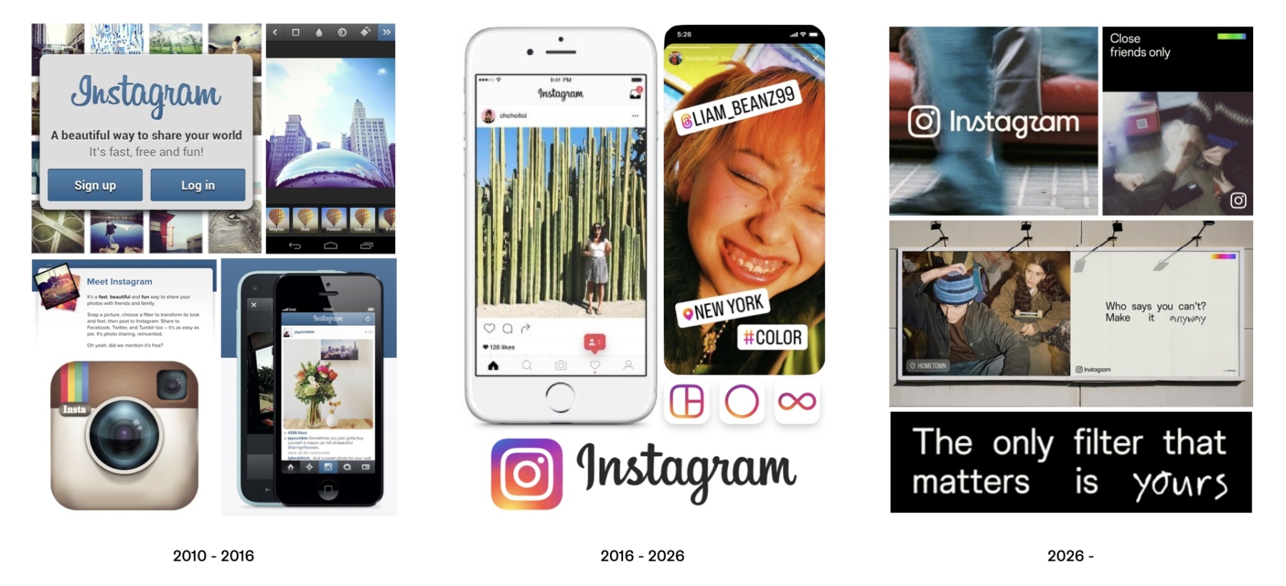
As a social media platform and a brand, Instagram has rarely been ahead of digital culture. Its visual identity, app design, and features are usually borrowed from other faster-moving platforms. However, this weakness makes it a useful case study of the evolution and devolution of the mainstream internet. Every version of the brand has reflected the dominant mood online, and the most recent rebrand is, unfortunately, no exception.
Internet as a place to belong
Instagram came onto the scene in 2010, when much of social media was still built around communities – think Tumblr and fandoms, Reddit and forums, Twitter and discourse, Facebook and life updates from your aunt.
Instagram’s original identity fit seamlessly into this ecosystem. Its cartoonish analogue camera icon, simple UI, square photographs, and cheesy retro filters were charmingly awkward. These limitations made Instagram feel less like a publishing platform and more like a public photo album for sharing snippets of your life.
Its identity reflected an optimistic idea of the social web with minimal pretence: that technology could create new spaces for people to find belonging. It was simply “fast, free and fun!”
However, the internet was already changing
Internet as a stage
As social platforms grew larger and more commercially valuable, the emphasis shifted from participation to performance. The influencer became one of the most defining figures of the late-2010s internet. So, Instagram transformed accordingly; metrics became more visible, personal expression became personal branding, and the fun brand became just another polished digital product.
The quirky retro camera icon disappeared, replaced by a simplified white glyph on a gradient. It was cleaner, flatter, more adaptable, and considerably less peculiar. The new logo and UI were about “stripping away the colour and the noise”. It prioritises commercialisation and simplicity over what it stood for in the beginning; sharing your world.
Not only was this rebrand a clear expression of the internet Instagram inhabited, but it also showed that, despite its enormous influence, it is culturally unoriginal. Rather than a defined brand, it is a catch-all container for whatever the internet had decided mattered.
Internet as an identity crisis
During the frictionless minimalism of the 2010s, there was a clear distinction between the visual language of brands and popular influencers and that of real “normal” people on the internet. However, as brands became desperate to look authentic, they started reaching for the messiness, emotions, distortion, and chaos of the human experience.
Instagram’s most recent rebrand taps right into this language with expressive typography, candid imagery, and a defiant tone. However, it has made itself look more human at precisely the moment the experience has become more algorithmic.
The earlier versions of Instagram reflected relatively coherent ideas about what the internet was becoming. First, a place to connect. Then, a place to perform. The current internet is harder to summarise.
We want digital spaces to feel human again but build them around algorithms. We celebrate imperfection but package it as an aesthetic. We constantly talk about authenticity while increasingly encouraging content that is engineered to hold our attention.
So perhaps Instagram's new identity is perfect after all. It looks exactly like the internet now feels with everything at once, and nothing in particular.
Author: Alice Pukhova, Creative Researcher at WMH&I