
Delving into a world of water and fruit.
WMH&I rebrands Hydra Juice – Multiple Marketing’s juice drink.
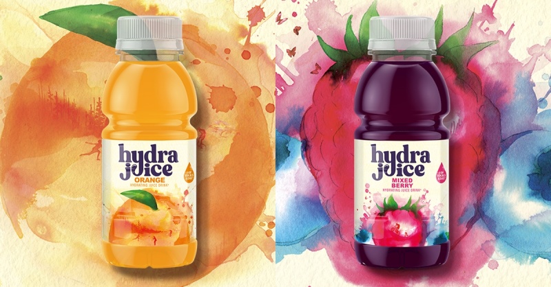
We all know them; the juxtaposing asks in a brief. A brand that is child-friendly yet must also appeal to adults. A design that should communicate energy whilst evoking a sense of gentle nature. Differentiate on a busy store shelf but use the visual codes of the category.
Multiple Marketing came with exactly these challenges to WMH&I for their Hydra Juice rebrand. Previously marketed as a juice brand with energy-drink attitude. We completely revamped the brand to sit as comfortably in a kid’s lunch box, as it does your sport’s bag.
The creative idea of this revamp was based on vivid watercolours to get a sense of fruit, water, and naturalness. Hidden within the fruit illustrations are people enjoying their active outdoor lives. We collaborated with the brilliant Jessica Durrant, who works mainly for fashion and beauty brands. Her work has featured in Vogue, and she counts Jimmy Choo, Diptyque and Starbucks amongst her clients.
For the Hydra Juice illustrations, she uses her favourite wet-on-wet technique with India inks. This technique uses wet paper with a wet paint to create dynamic and fluid effects with watercolour. When it dries it often creates little worlds inside them, which was the aim for these illustrations.
The typography in the logo smiles to the viewer. There is a sense of joy flowing through it. The tail of the ‘Y’ drops to form the ‘U’ in juice to link the two key product characteristics – fruit juice and water - in a jolly way.
The rebrand of Hydra Juice will be launched across stores in the UK.